Onboarding @ Infield.AI
Fueling the OSS maintainer’s takeoff with a NASA-inspired onboarding experience.
Role: UX/UI Designer | Timeline: 4 weeks | Tools: Figma, WebAIM
Background
Infield is a YC-funded OSS maintainer looking to redesign their onboarding flow. They also want help designing a complimentary diagnostic report to give to potential customers.
Problems
Infield’s current onboarding process doesn’t get some desired information from prospective clients—such as their work email address—resulting in lost leads. Plus, their design is functional but lacking personality.
Solutions
Revisit the current onboarding flow’s information architecture. Identify + design opportunities to get the data Infield needs from users.
To boost retention, Infield plans on offering a complimentary diagnostic report on new clients’ OSS dependencies. I studied data visualization in order to design it.
Redesigned Infield experience
TL;DR
Don’t have time to read this whole thing? Here are the main takeaways.
-
This was my first time working in the OSS space. I had to learn how to speak to a demographic that was unfamiliar to me, so I read interviews, researched competitors, and had many conversations with stakeholders about their current and prospective users.
It was also my first time designing a diagnostic report, and figuring out the best way to present dense information was a fun challenge. I was reading Tufte’s Beautiful Evidence at the time, and his methodologies were present in my mind.
-
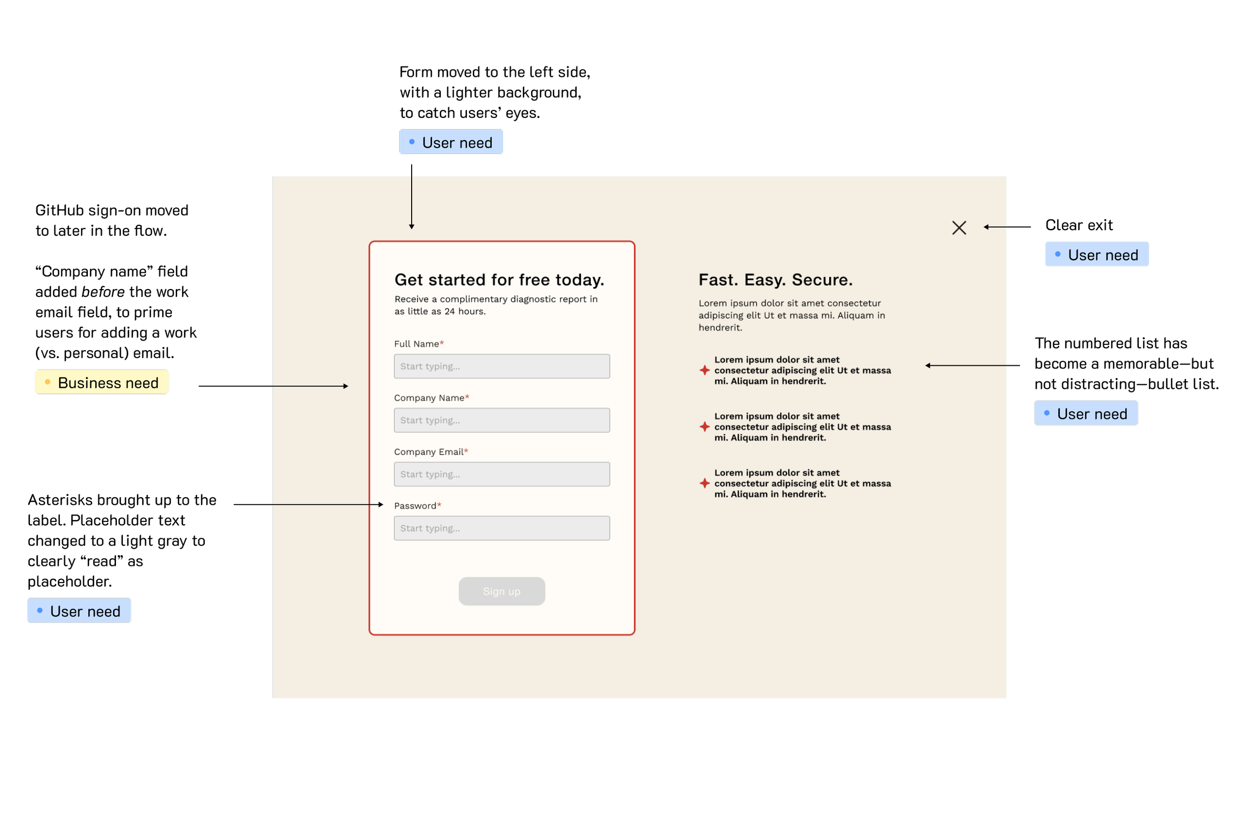
For the onboarding experience, I thoroughly researched the most successful placements for an account creation form. My not-that-surprising surprising takeaway: save the left side of the screen for what you want your visitors to see first. By placing a photo on the left, you can “set the mood” for them and welcome them in with the energy of the photo, but since our screen was text-focused, I placed the form on the left. It’s what users are looking for, and its the first place their eyes go.
I also had a Tufte quote running through my mind as I was designing the information-heavy diagnostic report: clutter calls for a design solution, not a content reduction.
-
I successfully designed an onboarding flow that encourages users to share the data Infield needs to do a thorough job. I also successfully implemented data visualization techniques to convey complex information in a digestible fashion. (“Success” here is determined by stakeholder satisfaction—Infield brought me back to reskin more of their product after this collaboration.)
Goals
User goals
To find a trustworthy, efficient maintainer who can help them. Also to understand what Infield is and what they’re getting into.
Business goals
To get more, better information from users and solicit high value leads. And to do all of this in a brand identity inspired by 1960s NASA.
Empathizing
Most of Infield’s clients are mid-senior level software developers and engineering managers who discover the company through Reddit posts. They’re desperate: they often have a deeply outdated OSS but lack the support, time, and energy to fix it. But they’re also hard to sell to: many developers want to be sure that the product isn’t something they can do themselves. They want to see value quickly.
Infield has two types of clients: those who take advantage of their services (that is, those who pay to have an Infield team member upgrade their code), and those who just use the software to see what they have to maintain themselves. We’re targeting the former.
Pain points
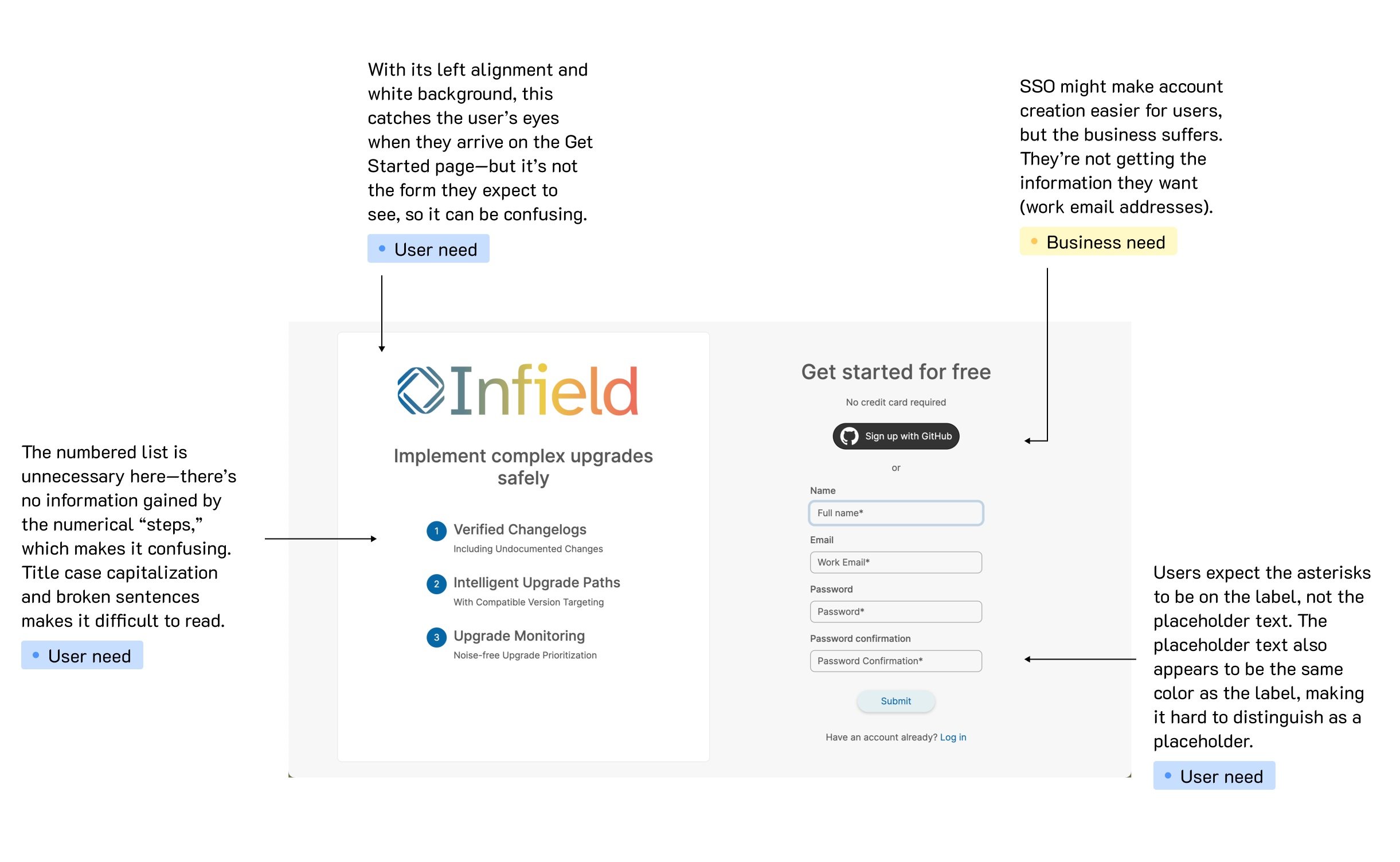
Stakeholders feel like the current design is “boring and busy,” which I agreed with. There are also a few small UX errors, like misplaced * for required information.
The current “Get Started” page
The current design was also leading users down the wrong path. By allowing SSO through GitHub, they were, yes, making their users lives easier—but they were making their own lives harder. Since users usually had their GitHubs connected to a personal email address, Infield wasn’t getting the more appropriate work email. They also couldn’t identify which repo a user wanted to diagnose, slowing down Infield’s ability to help. The result was lost leads and confusion.
How might we structure information so we’re as helpful as possible to users?
Brainstorming
Branding
“People underestimate their audience when it comes to designing for developers.” - stakeholder
For this project, the stakeholder wanted a brand refresh, specifically in the spirit of 1960s NASA manuals, which used infographics and minimal color to convey a lot of information in a small space. Their current logo is inspired by the sunset hues of the old Houston Astros logo—fitting given Infield’s work is largely born out of OSS being “sunset.”
I looked at advertisements and manuals from the 1950s and ’60s as well as modern designs in a retro-futurist style, noticing some clear themes: an intentional use of bold color, block letters, and negative space.
We based the design in three fonts. For the majority of the flow, we used Helvetica Neue and Work Sans, to keep it feeling simple, readable, and timeless. But for the diagnostic flow, we tapped Space Grotesk to help us lean into the feel of an old-school computer terminal.
Choosing the background of the onboarding flow was a major decision point. I wanted negative space to be present without the design feeling empty. I mocked up 5 options: one, a simple white and beige; another, more modern with a gradient background in the logo’s colors; and the remaining three with a more 1960s retro-futurist aesthetic: two-color designs that made the negative space serve both as a container and a participant in the conversation. We ended up choosing one of the more retro designs.


Information architecture
The way we structured language in this flow was crucial.
For the form, I opted to ask users for their company name before their company email: since one of Infield’s main goals was getting users’ work email addresses, I hoped that by asking for their employer’s name first, we would prime them to provide their work email address.
Doing the opposite—asking for the email address first, where it’s more expected—I feared would result in users glossing over the “company” part and just providing their personal email address.


Another pain point to address: Infield’s GitHub app makes it difficult for the team to know what repo to scan.
It was crucial to get this information from the users before they left the flow. I initially designed for the “Install” button to remain disabled until a user had shared the name of their repo, but stakeholders suggested that this structure might feel jarring to users. As a solution, we added this input field as a “last request” that appeared after they clicked to install the app, but before the GitHub window opened.
For the diagnostic, I found inspiration in card-based dashboard designs and considered Tufte’s preachings on keeping relevant information in conversation and proximity to each other.
I opted for a design that placed an emphasis on quantity. Users are coming to Infield to understand just how bad things are, and the easiest way to do that is through quantifying it: 90 stale packages, 4 abandoned packages, etc.
I wanted to highlight the gravity of the situation without overwhelming users, so I maximized negative space. I also users progress bars to put information in context: Rather than simply writing that their software was on V2.2 and had to get to V7.1, using a progress bar puts how far they have to go in a visual context.
Iterating
Email verification
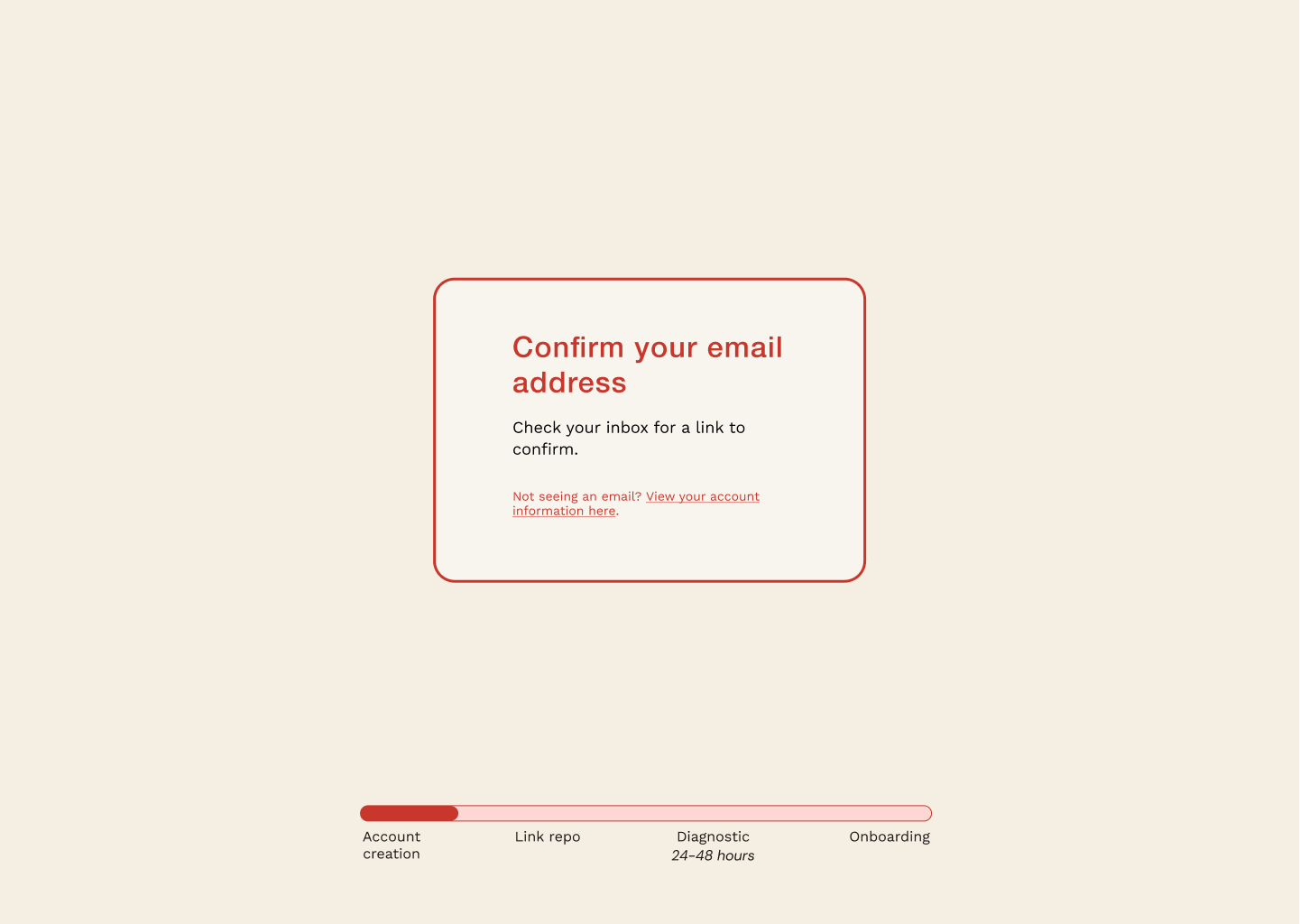
I weighed the pros and cons of email verification for this flow. Yes, it slows down the onboarding process—is there a way to let users confirm their email address without making them go to their email inbox?—but it is also necessary, and expected, given the sensitivity of the information we were scanning.
So, since we had to verify their emails, the next question was: how? Code or link?
I advocated for code. Since clients are using their company email addresses, it’s likely that emails with links from unknown senders will get blocked, causing frustration and slowing down the onboarding process.
Plus, if the user isn’t working from their primary browser, it could create frustration when clicking the link opens a new window in another browser. But a code requires a simple copy-paste, or, if they have previews enabled in their email notifications, they might not even have to leave the browser.
However, since Infield was already operating with a link-based confirmation, we stuck with that.
Color
Color was also researched and adjusted. My first high-fidelity design used a rainbow of colors on the diagnostic, but the stakeholder pointed out that so much color would feel odd to their developer audience. We ended up with a simple black, gray, off-white, and red design. The red echoed Ruby as well as those 1960s NASA designs.
For the loading screen, I initially designed a red circle expanding to fill an off-white background, but realized that could feel ominous—so I inverted the colors.
User control
The stakeholder shared that developers often hate to get on a call, which has made reaching out to them to schedule an introductory session difficult. Why not cut out the middleman?
By linking to a Calendly calendar (or similar), we put control in the users’ hands, allowing them to schedule the call at their convenience. The ability to get help is a heuristic I prioritized throughout this redesign, offering “contact us” points at a number of steps where friction might occur.
We also realized there was a distinct benefit to giving clients the option to select the volume of service they want. This way, users have a clear understanding of what they’re signing up for and Infield’s representatives get a better understanding of what a client wants before they get on that call.
Conclusion
This was a great exercise in information architecture and data visualization. By studying what was important—really important—to users and the business, I was able to reduce friction points so everyone was happy. I’m now working on a new project for this client: reskinning more of their app to match the style and UX of this flow.


