A Social Maps App For Skaters • Personal Project
Addressing frustrations in the skater community through a social maps app
Role: Team lead; UX researcher, designer | Timeline: 3 weeks | Tools: Google Forms, Figma, Figjam
Background
For the UX/UI bootcamp I took through Columbia University, we got to build an app that solved a problem, any problem. One team member shared a story: She and her boyfriend had lost a day of their trip in Florida trying to find a park they could skateboard in, but spot after spot had "No skateboarding allowed" signs. We wondered: Is it hard for members of the skateboarding community to find new skate spots?
Problem
Skateboarders, roller skaters, and bicyclists struggle with finding new spots to ride.
Solution
A social maps app that lets users save their favorite spots, discover new ones and follow friends.
TL;DR
Don’t have time to read this whole thing? Here are the main takeaways.
-
Only one member of our team was familiar with the skating community (and it wasn’t me), so getting perspective on skaters’ pain points was crucial. We interviewed everyone we knew and sent surveys to people we didn’t to make sure that our product would help them.
This project was completed in under three weeks, so there were some features—like the social feed—and branding elements that we weren’t able to design.
-
(1) One person’s experience doesn’t mean it’s everyone else’s: our app was born out of a skating-while-traveling experience, but most of our interviewees actually weren’t interested in skating during a trip.
(2) We weren’t the first to have this idea: since we’re not a part of this community, we didn’t realize how many skater apps were already out there until we did our research. Fortunately, our outside perspective helped us see the competitors’ shortcomings.
(3) Teamwork makes the dream work: As team leader, I learned new ways to encourage brainstorming—like making wireframes independently and blind voting on all of them—and tried to tap into everyone’s strengths.
-
We’d like to continue to explore the ways this app could benefit “people on wheels”—not just skaters and bicyclists, but people in wheelchairs, with strollers, and more. This was a priority of ours since the start, but we had to refine our demographic given the time constraint.
We’d also like to continue getting to know our target user and the brand experience they would respond to. Something edgy and cool, or more friendly?
Empathizing
We interviewed five "people on wheels"—a mix of skateboarders, roller skaters, and cyclists.* We also got 8 responses to a survey we posted in skater and roller skater subreddits.
The results confirmed our hypothesis: Yes, it’s hard to find new spots. Many people rely on word of mouth or Google Maps, but it’s hard to know if the spots have what they’re looking for before they get there. Our interviews and polls also shed light on our future users’ needs and habits. Bad pavement and too many pedestrians were shared pain points, while bicyclists worried about finding bike lanes and safety. Surprisingly, most respondents weren't interested in skating while traveling, and about 60-40 were skating solo vs. with a friend.
*We wanted to include people in wheelchairs and people using strollers but had to refine our focus because of the time constraints.
How might we help skateboarders, roller skaters and bicyclists discover new spots?
Brainstorming
Market research
We analyzed six competitors and mapped their similarities and differences. Many only cater to one demographic, like skaters, or have an outdated UI, which showed us that there was still room in the market for our app.
Ideating
Through brainstorming our own features and taking inspiration from competitors, we landed on a concept that was part maps app, part social network, where users could save spots to private or public maps, as well as follow friends.
This would offer exclusivity to those who want to keep their favorite spots private, while also offering opportunities for connection to those who want to skate with friends.
Pavd (pronounced paved) takes inspiration from the amenity users care most about: pavement quality.
Designing
Each member of our team designed a wireframe following the same user journey. We tested them, then voted on our favorite elements of each design and combined them into one.
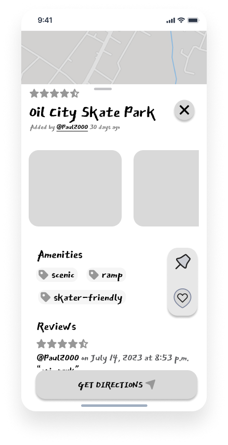
From the tests, we learned that users liked apps with some personality, so we went with one team member’s edgier font, and that they liked the convenience of linking with a third-party app provider for directions.
Iterating
Testing
Mid-fidelity tests revealed that users liked the concept and overall found the design easy to navigate. The pin+favorite icons were confusing to some users as they didn't immediately understand the difference between them (fair), so in the future we'd like to explore the best design for allowing someone to save a spot to try later vs. add it to their favorites.
While some testers liked the edginess of the design, others were distracted by it, so finding the right amount of "personality" in a design is also something to explore.
Playing around in hi-fidelity
Our group project concluded after mid-fidelity, but I continued to explore various personalities for our app in hi-fi prototypes. One is friendly, with soft 3D animations and bubbly letters.
While the other explores more of an edgy, skater aesthetic.
Conclusion
This project was a great exercise in teamwork, as we divided up responsibilities and found a way to combine each of our ideas into one effective app.
While we'd like to continue testing and iterating our app and learning about how we can serve the "people on wheels" community, our positive reactions from testers told us we were headed in the right direction


